Thanks for the feedback. Keep in mind that the reason we're giving you a chance to preview the new design is so we can work out bugs and make improvements before deploying the design. Last time we changed the design, we had a lot of little issues and scrambled to make changes after going live. This time we'll try to address all of the changes before going live. We're in no rush really, but once the bugs are worked out I think the new design will be a major improvement, mainly in the speed department.
To address some of the specific questions and issues that have arisen:
1. My Home is back.
2. The menus are different depending on whether you're viewing on a desktop or a mobile device. Also, the design changes based on screen size to give you the best experience regardless of what size monitor you have or what type of device you're using.
On mobile devices, the menus are condensed into a drop-down box, accessible by clicking on the three bars highlighted in this image:

Right now the options in that menu don't match up exactly with the options you get on a desktop, but they will before we go live.
3. We are considering leaving the current mobile theme as the default theme for mobile devices, since it is very easy to use, albeit limited in functionality (no photo uploads, for one). You would still be able to go back to the full site to utilize all features.
We are also looking at adding the tapatalk app option to TBN, in addition to our TBN mobile app. This, combined with the option of using the new theme should give you a bunch of options on mobile platforms. The reality is that mobile devices will never fully replicate the functionality of a desktop computer, and forums with lots of features are particularly problematic when it comes to making everything work. In an ideal world, we would probably have a much better mobile app, but until we cross that bridge we're going with a multi-headed approach.
4. As for pop-ups on mobile devices... this feedback came in when you were still looking at the old design, I think. Are you seeing ads blocking parts of the page on the new design?
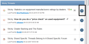
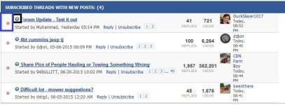
5. Regarding where you are taken when clicking on a thread title, I'll explain. Back in 2000, we upgraded our forum and chose to jump to the first unread post inside of a thread when you click on a thread title. That navigation option has become obsolete as most forums have the option to jump to the first unread post in a thread by clicking on a link directly beside the thread title (blue arrow). Clicking on the title will then take you to page 1, regardless of how many pages the thread has, or whether or not there are any unread messages in the thread. This option gives you the choice to go to the first unread message, or to page 1.
On TBN, we have people who like it both ways. Some people have been asking us to change our linking method for thread titles for years, while others are hooked and that's the first thing they will notice when we change it.
My preference is to change to the new method, which is used by most other forums online. We've also adopted this method on other forums we run, and have yet to receive any complaints. Once you get used to it, it's better.
Please keep the comments coming. :thumbsup: